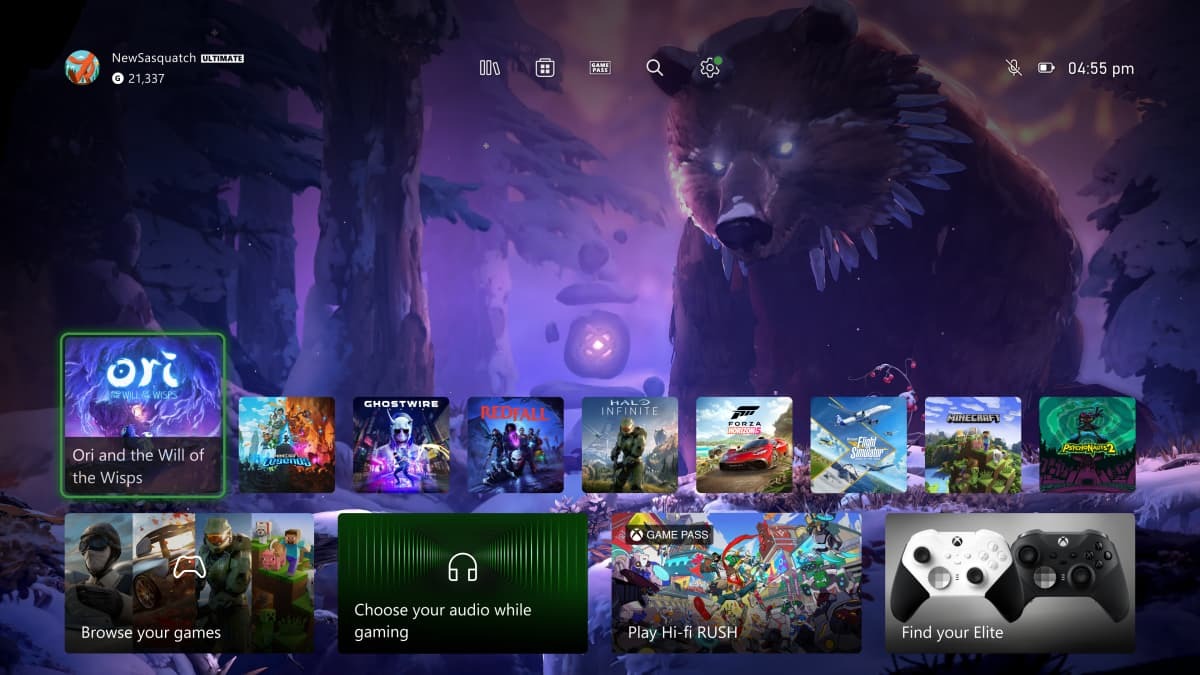
A new Xbox Home UI is on the way and some users can try it out right now. Alpha and Alpha Skip-Ahead rings of Xbox Insiders are now able to test out the new UI on their home consoles.
The UI adds a new quick access menu, allowing easier navigation to the games library, the store, Game Pass, search, and settings on the top of the Home Screen. The layout is now simpler, with more space to show off the background. The art is also more responsive, showing off new art connected to each game as you hover over their tile. A new button on the second row now opens “My Games & Apps.” The UI is still incomplete so more features may be on the way. Some testing users, for example, may see notifications inside relevant tiles, like a notice that this game is due for an update or a reminder that a wishlisted game is on sale.

According to a post on Xbox Wire, the new UI is based on feedback from previous iterations of the design. The team received feedback that the top of Home felt crowed and that there wasn’t enough space to enjoy the background. After taking a step back from Alpha testing and working on new prototypes with QA, this new version was created. More users will be able to test out the UI in time, and the full version will release to all consoles eventually.
The products discussed here were independently chosen by our editors.
GameSpot may get a share of the revenue if you buy anything featured on our site.


